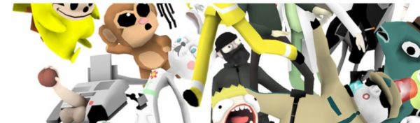
The External World from David OReilly.
BASIC ANIMATION AESTHETICS
For the purposes of talking about animation, aesthetics are simply any of the elements thatmake up the world of a film, the building blocks of images and sounds.The importance of animation aesthetics is such a subtle yet vitally important one. It mightseem superficial to discuss these things, especially because cinema is so much more todo with content and story than a pure aesthetic experience, but nonetheless the visualnature of animation calls for debate on the subject. There is a continuous raft of animation,both commercial and independent, which looks the same, and I don’t believe it has to beso. The more we think about the subject the more playful and interesting computeranimation becomes, the medium feels to me like a recently opened Pandora’s box which isstill being examined, understood and tamed.
Equally, we can often explain why a story works or doesn’t work, but the way pixels mix on the screen is just beyond our verbal grasp. Despite this we know that some things can just feel wrong in an image, even if we can’t explain why. An animation can seem simultaneously real and unreal. Bad aesthetics can make a film say things it’s not supposed to, look unprofessional and disengaging. Attention to aesthetics gains an audience’s trust, makes them forget they are watching a film and by extension feel any emotion you can think of. My goal is thus to explain why certain things work and others don’t.
3d animation is at a stage where many people have access to the tools but very few have any meaningful guidelines on how to use them. The problem is that there is simply too much power and very little control, essentially you get too much for free. Other forms of animation have benefited from their inherent limitations, but largely these do not exist with 3d.
This essay will mainly centre around my latest short film, Please Say Something, which won the Golden Bear for Best Short Film at the 2009 Berlinale. Though the award is irrelevant to this discussion, it nonetheless convinced me that my way of thinking about animation aesthetics and all the hidden theory behind it worked. Moreover, I never had to explain these elements of the film, either explicitly in the film itself or in promotional material surrounding it. As such this essay is not a guide to the film but more an analysis of my approach.
My central idea in constructing the world of the film was to prove that something totally artificial and unreal could still communicate emotion and hold cinematic truth. The film makes no effort to cover up the fact that it is a computer animation, it holds an array of artefacts which distance it from reality, which tie it closer to the software it came from. This idea is in direct opposition to all current trends in animation, which take the route of desperately trying to look real, usually by realistic lighting and rendering, or by forcing a hand-made or naive appearance. At the time of writing, this trend shows no apparent signs of ceasing.
AESTHETIC COHERENCE
‘A phenomenon is created truthfully in a work of art through the attempt to rebuild the entire living structure of its inner connections.’ – Andrei Tarkovsky
My central belief is that the key to aesthetics is coherence. In 3d we essentially create artificial models of worlds, I contend that what makes these worlds believable is simply how coherent they are; how all the elements tie together under a set of rules which govern them consistently. This coherence spreads to all areas of a film; dialogue, design, sound, music, movement etc. Together they create a feedback-loop which reaffirms that what we are looking at is true. The human eye wants this aesthetic harmony.
The interesting thing is that the sense of reality in animation can be whatever you want it to be. The rules governing an animated world can be totally arbitrary and artificial as long asthey are kept consistent, just as a lie repeated often enough becomes truth. If somethingin a world seems too out of place, if it breaks or overextends these rules, believabilityevaporates.[1] For this reason that we can look at a very simple, basic animation style andfind it just as absorbing as if it was filmed world-class actors in an elaborate set. Even ifanimation is technically bad, but consistently bad, it will be coherent and thus potentiallybelievable. It also explains why a live action film can be just as effective in black and whiteas well as in colour.
Aesthetic harmony comes from laws. Some may be imposed by technical limitations, others by style, ability, budget or even arbitrarily. Coherence does not come by following specific ideas like ‘appealing’ shapes or certain colour combinations, but just by keeping one’s laws consistent. In 3d some laws are almost universally adhered to, such as not allowing objects intersect each other, while others are variable, like using high-detail models or low-detail ones. It’s futile to say one rule is wrong and another right, I feel such a claim it’s destined to be disproved. The Disney studio published several books on why their methods were the only way to create believability, yet it all falls flat when applied to something like South Park, which few could deny is just as absorbing material. This is why I feel the only way of understanding believability is through the idea of coherence.
In a film, the exact rules and limitations of its world can only ever truly be known to the filmmaker. All feelings, sounds, moods, characters, colours, shapes and so on should be immediately obvious to him or her. It’s always a good idea to lay down the aesthetic rules which permeate the world you are creating. The director who internalizes his world to a great degree and immerses him or her self in the colour and sounds and feelings of it will never have to think twice about decisions later on. Each little thing will seem obvious and will find its place neatly.
My short Please Say Something employed a very specific set of rules in its aesthetics. They are all centred around the idea of economy. One of the main problems with 3d animation is that it takes so long to learn and then to use, from constructing a world to rendering it. There are many knock on effects of this, mainly it prevents people from attempting to use it and employ it artistically, the process is very discouraging for the individual to go ahead and make their film. Simple changes can take hours to do, and very often the process is so rigid it doesn’t allow any changes at all.
My goal therefore was to shorten this production pipeline to a bare minimum. I removed the entire process of software rendering by using preview renders, which are essentially snapshots of what you see on the screen, they take a split second to be generated.
The second most obvious decision was to use simple geometry (or models) to describe the world, this made it much faster to create, change and animate. It must be understood that it’s actually extremely easy to make an object or character in 3d smooth, it literally takes the click of a button, but it’s one I didn’t deem necessary to push. In general I always feel that any filter that appears to easily add a lot of beauty to an image or 3d model should be avoided, it’s usually a sign that the base material isn’t that good in the first place. Filters are like makeup on a woman, they can make her look really beautiful, but you’re really more interested in what she’s like without it.
Thirdly I used flat shading, there are no light sources or realistic shadows in the entire film. This decision was not entirely based on economy, as I could’ve used basic shading, but the drama of the film is essentially told through verbal dialogue rather than lighting, so it simply wasn’t necessary.
There were many other small decisions in the film. One of the most obvious aesthetic results of using preview-renders was that the image appears aliased or jagged. Every pixel has a solid colour which belongs to an object in the scene. While this is intrinsically beautiful, most software and filters are made for working with anti-aliased, or smooth images. I will explain some examples of how this created some hurdles and how I found ways of working around them to retain the film’s aesthetic coherence.
Firstly I handicapped myself from using the blur filter, which is one of the most commonly employed effects of them all. The problem with it is that it destroys the aliased aesthetic and therefore affect coherence. This rule was generally easy to uphold, except for one scene; I made a reference to the film Funny Games by Michael Haneke, in which the Mouse character rewinds the film itself with a remote control. In Funny Games, the character who rewinds the film frequently comes into focus and winks at the camera, it’s a very distinctive shot and I needed to include the Mouse doing it to get across that it was a reference, I wasn’t just stealing the rewind plot-device.
The problem was I needed to use a focal blur, which was against my rule of no blurs. The alternative I came up with was to use multiples of the scene which, when layered over each other, act like a blur, but crucially allow the pixels to stay aliased.
Another rule was using no fades in the film.[2] The nature of the fade is that it changes the opacity of the pixels, but the aliased aesthetic calls for every pixel to be solid and pure. There are a few instances where I wanted a fade but didn’t want to change my rule, so I found a way of fading something out pixel by pixel in a way that reads like an opacity change, the effect looks like this:
")
A last example was that I decided to animate everything on 2ʼs, or every second frame. We are used to seeing extremely smooth 3d animation (on 1ʻs, or movement in every frame). This was one of the main advantages of the technology in the beginning, that you would get all these in-between frames for free, whereas in classical animation every frame would have to be drawn individually. The eye will happily accept movement on 2ʻs but only if there is a static or slowly moving camera, if the camera is moving to much it makes the animation look choppy and unusual. In the end of the film I had one shot where I needed a moving camera, so I briefly had to break the rule and animate on every frame.
These are just a few examples of the hurdles one encounters in keeping a 3d world consistent and coherent. There are new ones in every project I encounter and they always force one to think outside the box and very often to use software in ways it wasn’t built to be used. The end result may not always be beautiful, but it will be consistent, and although it may not look realistic, it can still feel realistic.
A NOTE ON STYLE
‘A preoccupation with originality of form is more or less a fruitless thing. A truly original person with a truly original mind will not be able to function in the old form and will simply do something different. Others had much better think of the form as being some sort of classical tradition and try to work within it.’ – Stanley Kubrick
Style can simply be understood as a filmmaker’s unconscious aesthetic preferences. Their leaning towards certain kinds of worlds because they seem more authentic or pure, or because through their knowledge and experience they can recreate them faithfully. Filmmakers are usually not aware of their style because to them what they are doing is natural and obvious. To use a certain colour scheme or camera angle is simply because it’s the only way to do it.
Style is a by-product of following one’s ideals, not an ingredient, it’s something which comes out of a project, not goes into it. Style is often misinterpreted as a way to create an identity by superficially changing the look of one’s work. The aesthetic choices in these works have little or nothing to do with content and everything to do with looking different or current. This kind of thinking may be better defined as surface style.
Media which have an obsession with surface style are music videos, advertising and fashion. Their inherent aim is to stand out, to promote an identity, rather than pursue a vision, with only a small number of exceptions. The individuals making these works are often obsessed with their own industry and are viciously aware of being ripped-off or having their style bitten, as it were. Of course, originality is possible in any medium, and we all wish to create something new, something different and interesting, but this cannot be achieved by simply enforcing a look, it has to work from the ground up.
A NOTE ON SIMPLICITY
‘Everything as simple as possible, but not simpler.’ – Albert Einstein
The aesthetic rules defining a world should be as few as possible (but no fewer). The more elemental and simple an environment, the more exciting and visually rewarding it is when we introduce changes to it. For example if a film uses every colour of the spectrum all the time, it loses the power to use it creatively over time.
Simplicity in this light does not necessarily refer to visual detail or complexity, only the amount of aesthetic rules it allows. As such, Michelangelo’s David would have very simple aesthetics: pure white marble, use of exact, bold shapes and large scale. Although a committee might have agreed some more colours would be nice, or perhaps a mix of different marbles, it sticks to its simplicity. The idea of aesthetic simplicity produces the quality of elegance. The more rules we allow the more this elegance is compromised.
A short note on using few aesthetic rules: if the work is not bolstered by strong execution it may become copied or imitated. There is always discussion about what constitutes a rip off, particularly in the world of commercial animation, however I don’t believe it’s a subjective thing. A rip off occurs when the aesthetic rules of a work are copied by another. Aesthetic rules can be defined and therefore compared.
The aesthetic rules defining Please Say Something are specific and can be listed, these are: aliased pixels, use of isometric (flat) perspective mixed with normal perspective, elements which intentionally break the safe area, no texture maps (all colour was applied by painting the geometry directly), the use of completely synthetic voices and animation on 2ʼs, or every second frame. Naturally what rules you make are just as important as what you avoid using, these were primarily: no motion blur, no focal blur, no ray tracing or complex shading, no mesh-smooth, no handheld camera, no vignettes, no glow, no fades, no crossfades, wipes or transitions.
CONCLUSION
This was a basic introduction to my way of creating animation and my model for examining it. It’s broad enough to apply to any form of animation, extending to things like special effects and video games, but specific enough to isolate and describe details.
The technology of 3d animation is developing at a blinding speed, new tools and techniques are being added every year, and it is only a few films which survive this development and manage to appear undated. There is an effect relating to all this invention, lets call it the rapidly expanding aesthetic library, which every animator and digital artist possesses internally. Each year what passes for 3d realism gets slowly refined, people’s internal library gets updated and suddenly everything before starts looking dated and even stylized. An audience of nonprofessionals has the same internal library, it’s just updated over longer periods of time. 3d animation that once would stun an audience with its realism now barely has any effect, or looks wrong and out of place. A small aesthetic discrepancy may only be seen by one person in an audience, but we know from experience that in a few years others will notice it, and in ten-fifteen years audiences will find it blindingly obvious and laugh at it. Of course one can pass off bad aesthetics in the present, one can dazzle audiences with new effects and technology, but the fact is that cinematic history is an aesthetic pedant. It’s very selective about what it keeps and what it forgets.
An understanding of aesthetics gives the filmmaker the ability to observe a film both broadly and in detail and understand it. It allows him or her to make any kind of world believable by knowing exactly what works and doesn’t work, and rather than feeling things seem wrong, to be able to point them out specifically. Finally, knowledge of aesthetics is an essential key to originality. When we are forced to examine our aesthetic choices we lead ourselves to new ways of thinking and new ideas. Those who aren’t fully conscious of the aesthetic fabric of their worlds will revert to default decision making, essentially to the common doctrine, or mediocrity.
The fact is that there is so much possibility in 3d software to create original worlds there is simply no excuse to try and recreate other ones. To get there I feel we should forget everything about the idea of right or wrong, of beauty and ugliness, and focus on the idea of coherence.
[1] An analogy would be a storyteller using a wrong word in his delivery; when there is a break in the flow, our focus shifts from the story to the error.
[2] There is a single fade to black, which is where the story ends, but this is the exception to the rule.